


This article was updated on 04/142025
What’s the most helpful device in history? Hint: it’s what mobile first design is about…
Mobile devices are the primary way people use the internet now — so it shouldn’t be too surprising to hear that over half of all the website traffic in the world comes from that magic device in your pocket! However, desktop users are often neglected in mobile-first design approaches, suggesting that this method may not adequately address the needs of businesses that rely on desktop traffic.
However, you don’t have to sacrifice one for the other. As developers we build for both so your audience can have the same brand experience across all devices. More on that later.
Mobile-first design for websites has continued to become more relevant than ever before, so much so that Google is now using Mobile First Indexing — which means that Google now predominantly crawls your website’s mobile version for indexing and ranking on their search results page.
Mobile devices are the primary way people use the internet now — so it shouldn’t be too surprising to hear that over half of all the website traffic in the world comes from that magic device in your pocket! However, desktop users are often neglected in mobile-first design approaches, suggesting that this method may not adequately address the needs of businesses that rely on desktop traffic.
But here’s the thing: you don’t have to sacrifice one for the other. As developers, we build for both so your audience can have the same brand experience across all devices. More on that later.
Mobile-first design for websites has become more relevant than ever—especially now that Google uses Mobile-First Indexing. That means your site’s mobile version is the one Google crawls first when indexing and ranking your content.
Before we dive into the how, here’s a quick snapshot of what mobile-first design is all about:
- Start Small, Win Big: Mobile-first design begins with building for the smallest screens first, ensuring a seamless experience across all devices.
- Google Prioritizes Mobile: Mobile-first indexing means Google now ranks your site based on its mobile version—optimize accordingly.
- Touch-Friendly is Non-Negotiable: Design with thumbs in mind—make buttons tappable, layouts scrollable, and interactions intuitive.
- Speed and Performance Matter: Fast-loading pages are critical for user experience and SEO—optimize images, videos, and hosting.
- Think Future-First: Mobile-first design ensures your site adapts to evolving technology and user behaviors, keeping it competitive long-term.
Let’s break down what it takes to design for the modern web—from strategy and structure to speed and scalability.
Table of Contents

The Rise of Mobile Usage and Why Mobile-First Design Matters
The proliferation of mobile devices has revolutionized how we access the internet. According to recent statistics, over 60% of internet users now access the web through mobile devices. This shift has led to a significant increase in mobile traffic, with mobile devices accounting for over 50% of total website traffic. And there are no signs of slowing down. Mobile will continue to become even more dominant as time passes and technology improves.
As a result, businesses and designers must prioritize mobile-first design to cater to the growing number of mobile users. Mobile devices are now the heartbeat of our daily routines. Providing instant access to information, effortless communication, and making online shopping just a tap away. Whether it’s checking emails, scrolling through social feeds, or making quick purchases, these devices are the go-to solution for staying productive no matter where life takes you.
What Is Mobile-First Design? Strategy, Benefits, and Examples
As you might imagine, the Mobile First design concept is pretty self-explanatory.
Mobile-first design is a website design process that prioritizes designing the mobile experience before adapting it to larger screens. Or making sure it’s top of mind. It’s all about thinking small—literally!
The mobile first approach is crucial for improving user engagement and conversion rates, especially for businesses where users are more inclined to interact via mobile – Think Generation Z and Alpha.
To tell you the truth, mobile first has been in the works for quite some time. Google has long telegraphed its decision to move towards mobile by adopting a mobile-first design strategy and philosophy since 2010.
Google’s Mobile-First Indexing: What It Means for Your Website
Google has recently reached a milestone in its indexing initiative that began in 2016. This year, on July 5th, Google began crawling and indexing websites just using its Mobile Googlebot. This development signifies a substantial change that establishes the mobile experience for ranking and finding websites moving forward.
Why Mobile First Website Design Is More Important Than Eve
There are real benefits to designing with mobile devices in mind, and not only because mobile traffic is on the rise. It encourages more streamlined content, ensures touch-friendly navigation, boosts responsiveness, and optimizes performance—leading to faster load times and a better user experience. These factors not only enhance user satisfaction but also contribute to stronger SEO and improved conversion rates, especially in e-commerce. After all speed is critical, slow pages drive users away fast!

Key Principles of Mobile First Design
Prioritizing Content for Mobile First Web Design
Since the real estate of a mobile screen is much smaller than that of a desktop monitor, prioritizing content becomes even more critical in the mobile-first design strategy.
As such, this philosophy encourages you to take a more strategic approach: you have to be more thoughtful of what content needs to be prominent on the page and define what’s the core message, key products, or most vital information for your users. As a result, they will find the information they need more quickly and without having to wade through extraneous or redundant information.
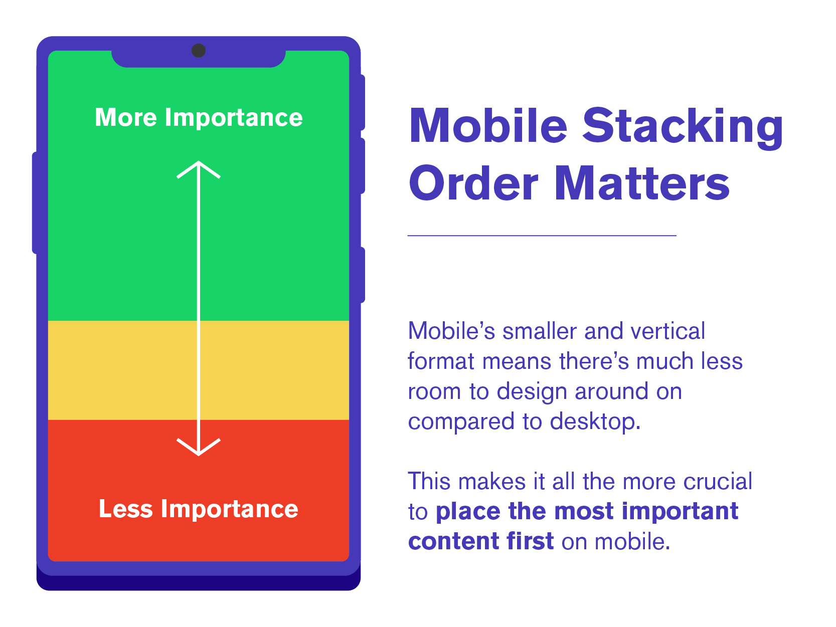
The Bottom Line: Mobile First Design emphasizes the need for content prioritization on mobile websites, compelling designers to predominantly display critical content of sequential importance to ensure a better user experience.
Mobile First Design vs Responsive Design
Nowadays, you would be hard pressed to find a content management system that doesn’t employ responsive design. One of the most essential practices spawned from the mobile-first design approach is responsive web design. Nowadays, there are a zillion different mobile devices to choose from, which means there are also a zillion different screen sizes to accompany them. So, if you tried to create a layout design for each possible size manually… well, let’s say you’d make Sisyphus’s job look pretty easy.

Enter responsive web design. In its simplest form, responsive web design allows you to create a website that seamlessly responds to any screen size or device, giving you a consistent experience regardless of which device you’re using it on. It employs flexible grids and media queries to ensure optimal user experiences.
Web designers and developers enable this by using flexible grids, layouts, and images that fluidly and automatically adjust based on the size of the device the user is using.
Fluid responsive design is why I’m a fan of using Divi by Elegant Themes on WordPress — its builder allows you to streamline sizing and settings for every module across all device sizes, cutting down on development time.
The Bottom Line: The Bottom Line: Responsive design techniques allow websites to work fluidly and accommodate according to the size of the screen on which the user is viewing your website. However, it’s a rough draft, and everything is in place but you’ll need to fully optimize the website for mobile.
Touch-Based Interfaces in Mobile First Website Design
As such, the mobile-first design places significant importance on touch-based interfaces. You must optimize buttons, links, and interactive elements to be touch-friendly, ensuring they’re appropriately sized, well-spaced, and easily tappable.
Using well-designed touch-based interactions, mobile-first websites provide users with an intuitive and effortless navigation experience, enhancing usability and making their visit feel more natural and enjoyable.
Touching a mobile device now feels as natural as clicking a mouse on a desktop. However, how we interact with websites on our mobile devices vastly differs from how we do on a desktop PC.
Touch-based interactions include tapping, swiping, pinching, and other gestures that users employ to navigate websites and interact with content.
Hover actions and animations, for example, are standard on desktops but not permitted on mobile devices because you can only touch the device. There are no “in-between” states. So, developing any hover interactions on desktop first would necessitate re-engineering the experience to operate on mobile.
That is why you should adopt a mobile-first design philosophy instead. This way, you can design the site so that people understand how to interact with it intuitively, resulting in a better overall user experience.
The Bottom Line: Touch-based interactions are the primary way to interface on most mobile devices. As a result, a mobile-first design must focus on making everything touch-friendly, from the buttons and navigation menus to any other interactive elements.
Mobile Performance Optimization
With mobile network technologies like 5G now achieving speeds that are becoming comparable to home internet connections, the demand for a fast-loading site is higher than ever, especially on mobile devices.
However, mobile devices still face limitations that their desktop counterparts don’t need to worry about—for example, spotty connectivity and the mobile device’s computational power.
Applying a Mobile-First design approach ensures you’re optimizing from the bottom up. If your website loads fast on mobile, then you can be sure it will also load fast on desktop—but the reverse isn’t always true.
Performance optimization isn’t just about enhancing user experience; it also plays a crucial role in search engine rankings.
In short, better performance = better SERP rankings = better conversion* (if you have good web design!
The Bottom Line: While mobile networks and devices are improving rapidly, they still have limitations compared to a stationary PC with a stable connection to the Internet. Mobile-first design emphasizes optimizing performance so your site loads fast on every device.
We can’t stress enough the need for speed! There are too many options on the web, and users aren’t going to wait for a slow website to load.
SEO Benefits of Mobile-First Design in 2025
As I mentioned before, Google very recently introduced an update to its algorithm, which now uses your website’s mobile-first indexing on its SERPs. If you’ve been religiously following Google’s algorithm updates, this is probably no surprise since they first introduced an update favoring mobile-optimized sites back in 2015.
Like any reputable business, Google has its user experience first and foremost in mind. So you can see why they’d rather award a better rank to a website that can provide their clients with a better mobile experience than those without.
This means that websites with a poor mobile experience will be negatively impacted by this change. So, I recommend making your website mobile-friendly a very high priority if it isn’t already.
Remember, with the increasing use of mobile devices for local searches, ensuring your site is mobile-friendly is more crucial than ever for your SEO – search engine optimization.
Remember what I said about looking up restaurants on the couch earlier? Well, it’s especially true on the go as well — mobile is often a user’s first choice for searching for businesses to solve a problem they have. So having a site that takes advantage of mobile first design will help you with local search visibility—big time!
The Bottom Line: With mobile devices as people’s first choice for internet access, Google now uses mobile websites primarily for indexing purposes. This makes mobile-first design more critical than ever regarding organic discoverability in SERPs.
Top Mobile First Design Strategies for Better UX & SEO
In my experience with mobile-first design, making strategic choices is crucial to ensuring a user-centric experience. Typography, button sizes, and content prioritization are just a few key elements of that experience you need to nail down. Let’s look at some strategies you can implement in your mobile-first design approach.
Content Layout
Since the viewing experience on mobile devices is vertical, websites are more centered around scrolling down the page rather than having a ton of horizontal space to lay out your content. As such, the mobile-first design emphasizes the importance of choosing your “stacking order” wisely.
The goal is to place the content you need your viewers to see toward the top of the page. Since user attention spans are limited, not including the most important content up top risks your viewers not finding what they’re looking for.
Website Typography
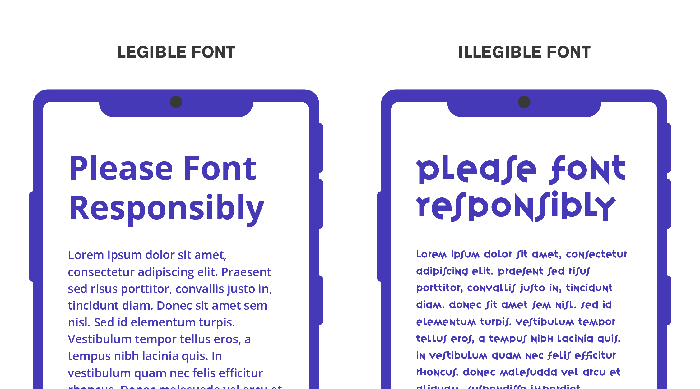
Choose easily legible fonts that are easily read on smaller screen sizes. There’s no need to get funky or artsy when it comes to body copy. The halmark is elegant and easy to read.
A good rule of thumb to use is to choose fonts with a taller x-height — this refers to the height of the lowercase letters. Fonts with taller x-heights are much easier to read at smaller sizes, which is a perfect use case on mobile.
You can still use flashier fonts for larger headings, but I recommend using an easily visible sans serif for smaller body content.
We use Google’s Open Sans for most body copy text on websites. Part of the reason is the amount of space—known as “kerning”—between characters. Google describes Open Sans as “optimized for print, web, and mobile interfaces and has excellent legibility characteristics in its letterforms.”
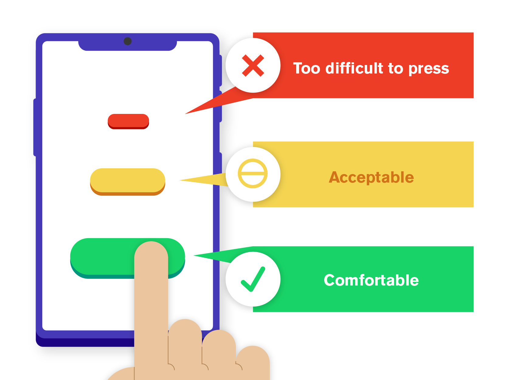
Button Sizing
Buttons are a cornerstone of website design — and on mobile, they must be sized appropriately. The sizes of our fingers are static… we can’t exactly change that! Your buttons should be big enough to be pressed comfortably on mobile devices. And if multiple buttons are next to each other, ensure enough spacing between them so your users don’t accidentally misclick on the other one.
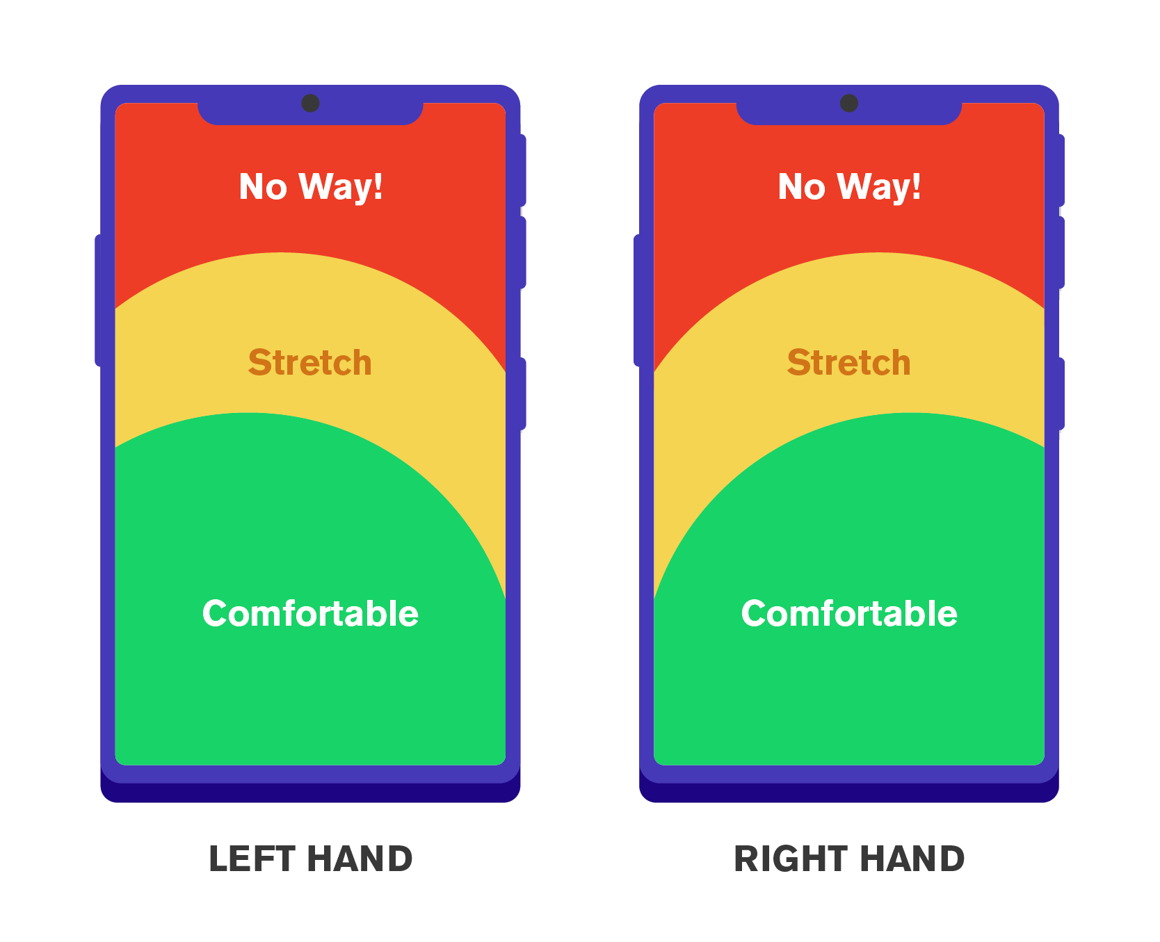
Button Placing
Where you place your buttons is just as important as how big they are. Take a quick exercise yourself. How far can your thumb reach out comfortably if you hold your phone without shifting it in one hand? Unless you’re Mister Fantastic, probably not that far. The last thing you want to do is make it difficult for someone to click your (Call To Action) CTA button while still on the fence.
The aim of most websites is conversions.
The exception to the rule is your navigation buttons (like a hamburger menu): this is fine because the user is already trying to go elsewhere, so you’re not breaking their flow on the current page.
Popups Suck:
The best practice I can offer for popups on mobile can be summed up with one word: don’t.
I don’t know anyone who has ever said, “Oh boy, a popup advertisement!” And I feel pretty safe betting that the same is true for you. Sure, popups can sometimes have their place—but that place is not on mobile devices! Be judicious when applying a pop-up, and ask yourself if you truly need it.
Once again, I’ll refer to the smaller real estate you have on a screen… and how annoying it is for A) your whole screen to shift focus abruptly from what you were doing. And B) how hard it can be to find maliciously small or hidden “X”s to close out of them. Make sure you have a super easy way to exit a pop-up if you need to apply one.

Mobile performance optimization techniques
When designing, you must keep mobile webpage speed in mind — it’s non-negotiable! While mobile networks have made significant progress in catching up to traditional internet at home, it’s still crucial for your site to load fast for your user experience. And since your mobile speed is also tied to SEO, having a faster mobile experience will bump you up in the rankings.
Proper Image Sizing & Compression: While your images may resize responsively, if they were sized for desktop use, you’re killing your mobile load time. Remember, mobile devices are physically much smaller than PC monitors, so images can be saved at a smaller pixel height and width and still display crisply. This will save your users from waiting longer to download your images and using more of their network data.
Limit Animation: While website animation adds an extra layer of intrigue and interactivity, if you aren’t careful, it can weigh down your site’s speed, especially on mobile. Test your page speed frequently and use only as many animations as your website and host can handle.
Video Use & Compression: Video is a fantastic way to differentiate your website, and if it’s a high-quality asset, that can make your site really stand out. However, video file sizes are usually pretty large in terms of dimensions and file sizes. Converting your video file with proper compression and encoding or using next-gen formats like WEBM can save you a lot on file size.
Also, you should always consider using a container with an external link to YouTube or Vimeo. This way, you don’t have to host the large video file locally.
Premium Caching Plugins: While this is technically a cross-platform upgrade, it’s still important to note its use on mobile. Using a premium caching WordPress plugin like FlyingPress will allow you to leverage a full suite of speed improvements like Lazy Loading, Minifying CSS/JS, and many other options to boost your website’s speed on mobile (and every other version of your site)!
Invest in a Good Hosting Service: This one is another cross-platform upgrade, but this is where it all begins regarding speed. You can optimize your website as much as you want, but it will only get you so far if you aren’t using a high-speed hosting service.
Your hosting provider can have one of the biggest impacts on webpage speed
If you’re looking for one of the best WordPress hosting platforms, I’d recommend Rocket.net. We have seen a dramatic increase in performance since switching to this hosting platform, which includes Enterprize Level Cloudflare.
Getting a 90–100% Google performance score on Lighthouse has always been extremely challenging. We started on A2 Hosting, switched to Siteground, and finally chose Rocket and the Flying Press Caching Plugin. For our business website and our clients hosting.
You can really get into the weeds regarding hosting. The bottom line is we can now easily achieve a 90–100% score within specific parameters. Elements such as page animation or video banners will cause a lower score, but we still see excellent performance scores even with the aforementioned items.
Please remember that no hosting platform will resolve issues of poorly optimized images or websites loaded with unnecessary bloat.
Having a quality host will also allow you more leniency in optimizations that give you way more flexibility in creating a site that impresses on mobile. Our new hosting platform has been a game changer.
Testing and validation
Cross-device Testing: Testing mobile first designs on real mobile devices is crucial as it provides an accurate representation of how your website functions in the real world.
The more devices, the better. You can also use browser developer tools like Browserstack to test your website on thousands of real devices and browsers to ensure your mobile site works consistently on as many devices as possible.
Google’s Mobile-Friendly Test: If you ask me, there’s no better way to test your website’s user-friendliness than using PageSpeed Insights. This tool will systematically break down every single pain point on your site—even some pretty granular stuff — and tell you how to improve on it.
While it can be pretty strict, it’s the best way to ensure compliance with Google’s new mobile-first indexing standards.
Common Mistakes to Avoid in Mobile First Design
When designing for mobile devices, it’s essential to avoid common mistakes that can lead to a poor user experience. Here are some pitfalls to watch out for:
- Not Prioritizing Content and Features for Mobile Users: Failing to identify and highlight the most important content can frustrate users and lead to higher bounce rates.
- Not Using Responsive Design Techniques: Without responsive design, your website may not display correctly on different screen sizes, leading to a disjointed user experience.
- Not Designing for Touch-Based Interactions: Overlooking the importance of touch-friendly design can make navigation difficult and reduce user satisfaction.
- Not Optimizing Performance: Slow loading times and poor performance can drive users away. Ensure your site is optimized for speed and efficiency.
- Not Testing and Iterating: Failing to test your design on various devices can result in overlooked issues. Regular testing and iteration are crucial for maintaining a high-quality user experience.
- Not Considering the Unique Constraints and Capabilities of Mobile Devices: Ignoring the specific needs of mobile users can lead to a subpar experience. Design with mobile constraints and capabilities in mind.
By avoiding these common mistakes, you can create a mobile-first design that provides a superior user experience and meets the needs of your mobile audience.
The Future of Mobile-First Design: Trends and What’s Next
With the rapid pace of technological innovation, the gap between mobile and desktop experiences is only going to widen. As 5G speeds ramp up and mobile devices continue to evolve, performance restrictions will become a thing of the past—ushering in a new standard for quality, speed, and user experience on mobile.
Looking ahead, the future of mobile-first design may include voice-driven navigation, AI-powered personalization, and immersive experiences through AR and VR. While some of this remains on the horizon, the direction is clear: mobile is leading the way.
At Mighty Fine, we embrace these advancements and guide our clients toward digital strategies built to last. Mobile-first design isn’t just a buzzword—it’s the foundation for a scalable, future-ready website. Whether you’re launching something new or giving your existing site a much-needed refresh, now is the time to focus on the mobile experience.
After all, your mobile site isn’t just a smaller version of your website—it’s the front door to your brand. And we’re here to help you open it wide.
Contact Mighty Fine Co. a US Web Design Agency today. We’re confident you’ll love where we’re headed.to improve the digital experience of your website, join us on this trip.


